
This project represents the hospitality and tourism industry, where the main task is to convey the atmosphere and sense of peace of the place, while providing a convenient booking process.
ⓘ Response within 24 hours!
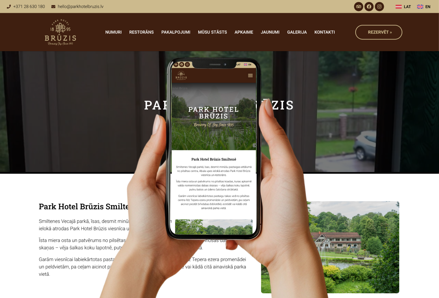
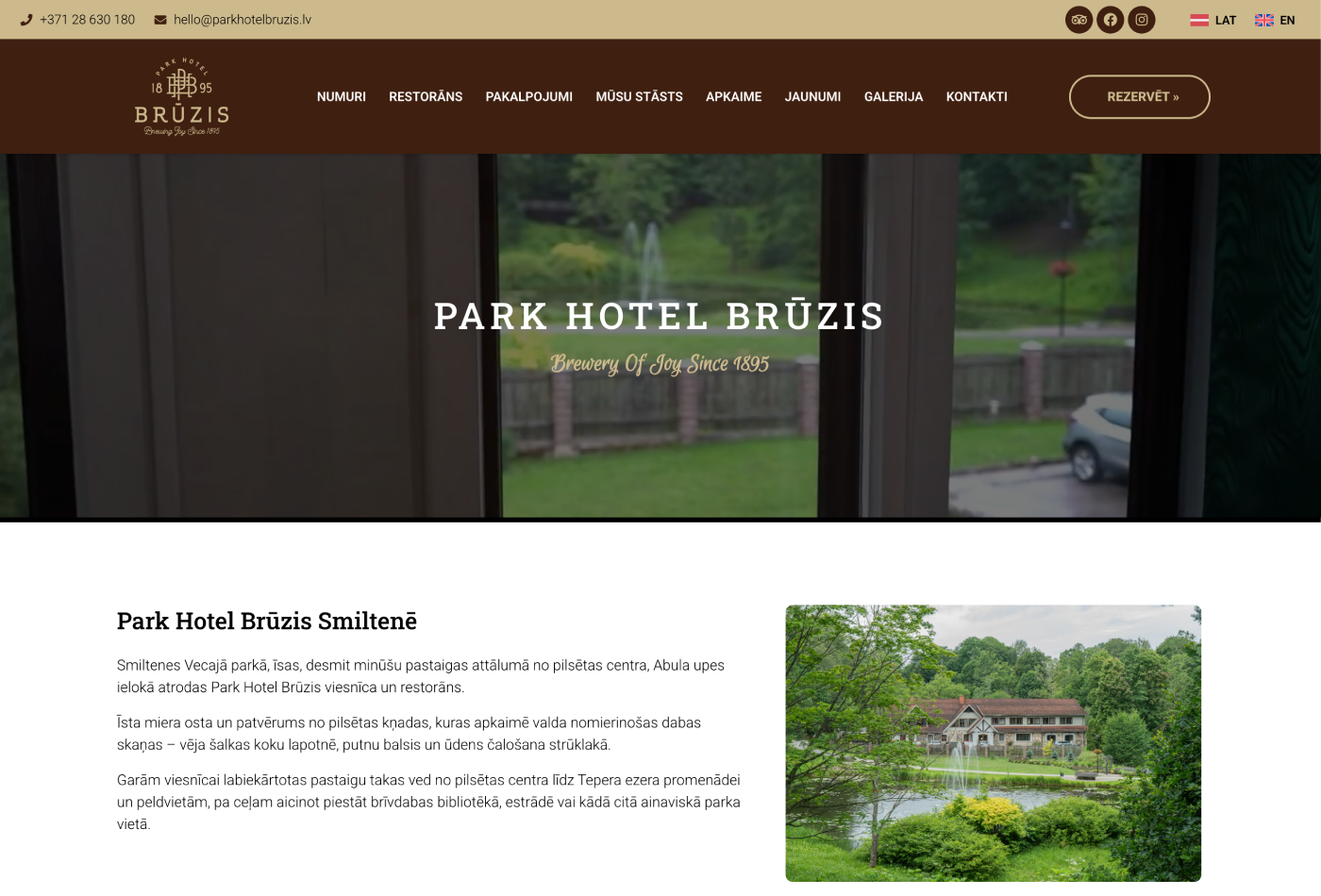
The goal of the project was to create a modern, aesthetic and functional website for the historic Smiltene hotel and restaurant “Park Hotel Brūzis”. The website serves as a digital story about a place where a brūzis built in 1895 has been reborn into a modern haven of peace within the city park.
A comprehensive hospitality industry solution has been developed:
Digitalized guest experience: With the support of the EU fund, fully digitalized guest registration and access to rooms have been integrated, ensuring a modern and convenient service.
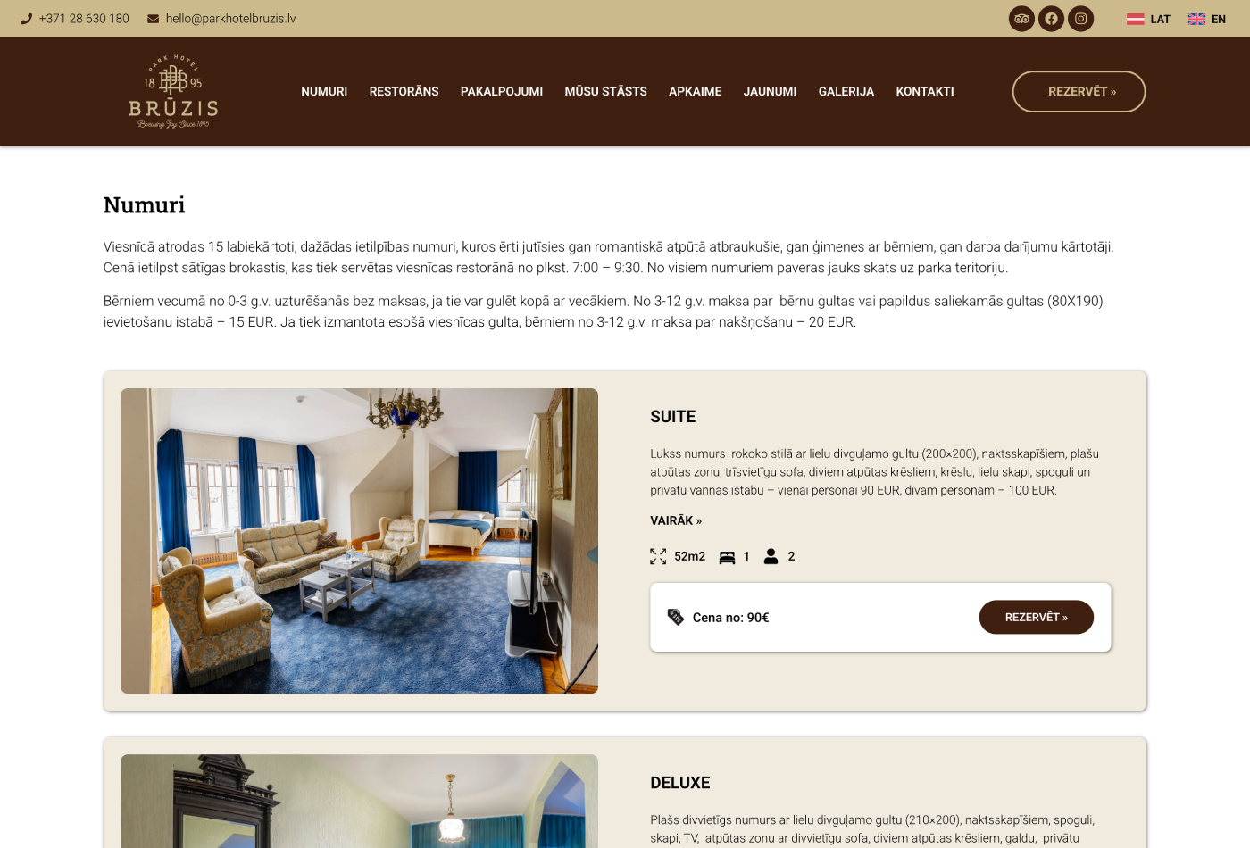
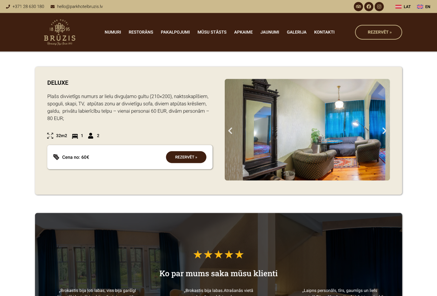
Structured service catalog: Separate, easy-to-view sections have been created for rooms, restaurant, room rental and inventory rental.
Visual Storytelling: The “Our Story” section and integrated gallery help convey the historical heritage of the place and the “Brewery of Joy” philosophy.
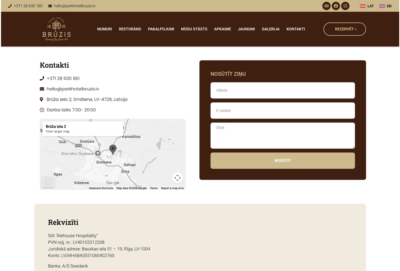
Multilingual support (LV, EN): Ensured accessibility for an international audience, promoting tourism to the region.
The visual design reflects elegance, nature and history:
Atmospheric photography: The emphasis is on large-format images that show the hotel’s architecture, interior and surrounding park, creating an immediate desire to get there.
Color palette: Natural, calm tones are used, which harmonizes with the park environment and historic walls.
Clean typography: Fonts that are easy to read and exude a classic yet modern feel have been selected.
Individual illustrations and icons: Graphic elements have been developed that help the user navigate the range of services and emphasize special offers (e.g. “pet-friendly”).